What is an outlier?
In Data science certain data displays a wide range of disparity from the rest. Such data can represent an error or a fault. In very simple terms an outlier in Data science represents data that is glaringly different from a set of data, which in other words is the odd man in the crowd.
Outliers are data points that are unusually and drastically different from the majority of the data points in your sample. It could be a significant observation or a little one. Because of their extreme characteristics, outliers can cause biased findings when generating data statistics, impacting further statistical/ML models.
Look closely at the data in the square brackets and see if you can spot an outlier.
A.[40]
B.[37]
C.[80]
D.[90]
E.[50]
F.[50]
G.[100000]
That was easy, right? Well, yes the answer is G and it was easy to spot because we only have a data set of 6! Imagine you had to look for outliers in big data, that will be an impossible task sorting that out the outliers using the human eyes. That is why Python and R are tools used to create graphs that will detect these outliers.
Outliers can be either univariate or multivariate.
Extreme points on a variable are commonly referred to as univariate outliers. For example, in the above case, 100000.
In this post, we’ll look at a few different methods for detecting univariate outliers.
Outliers in multivariate statistics are a collection of uncommon data points for two or more variables. Scatter plots are used to show the association between the response variable and one or more predictor factors in multivariate settings.
How to detect outliers in Data science
Graphing the characteristics or data points is the simplest technique to find an outlier. One of the finest and simplest ways to make inferences about the overall data and outliers is to use visualization. The most popular visualization tools for detecting outliers are scatter plots and box plots.
Scatter plots — Scatter plots can be used to specifically find outliers in a dataset or a specific attribute.
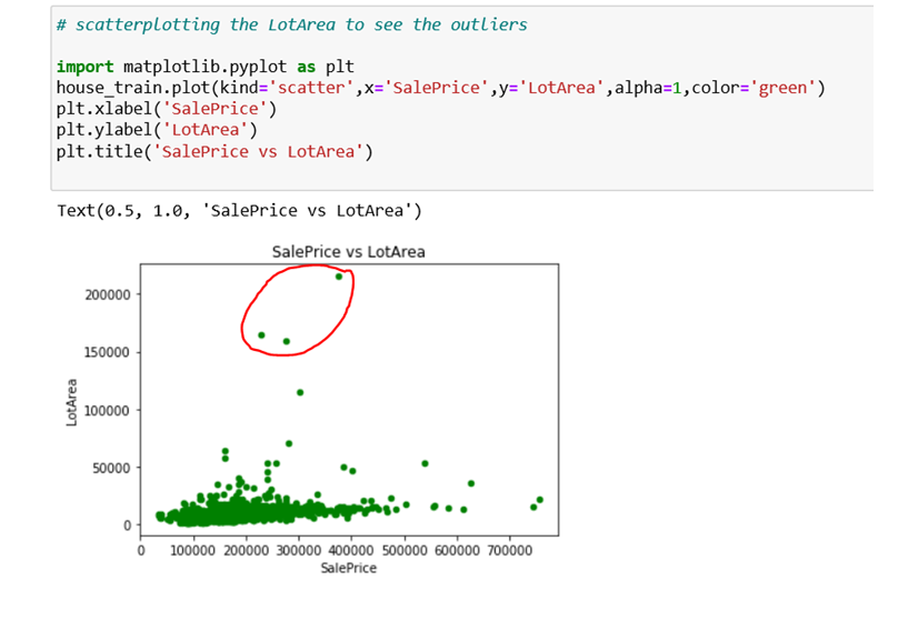
As an example, I’ve utilized a data set called “House Price Prediction” in the graphic below. The dataset was obtained via Kaggle.
The dependent variable “Salesprice” is concentrated more within the range of 0–55000 approx of the feature LotArea, as shown in the graph, and the points over 150000 are clearly outliers, resulting in disproportionate statistics regarding the overall structure of the data.
As a result, we may create scatter plots for all of the dataset’s attributes that we anticipate may contain outliers.
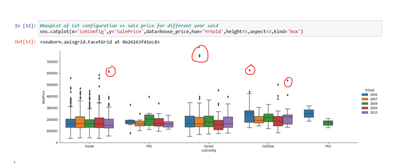
Box Plots: Another easy visualization tool for detecting outliers is the box plot, which uses the Interquartile Range (IQR) technique.
A handful of the outliers are indicated in red circles in the graph below.
We’ve plotted the Saleprice versus the LotConfiguration by year in this graph.
In the graph below, there is an outlier in the “corner LotConfig” with a Saleprice of more than 700000 for the year 2007.
Histogram
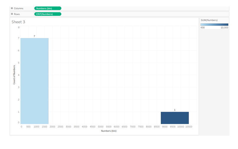
Outliers can also be identified using histograms. Isolated bars on a histogram, on the other hand, can indicate the presence of outliers.
If we look at our first set of eight integers, we can see that the outlier 10000 is far to the isolated right bar, while the remaining seven data points are all to the left bar.
Histograms are most commonly employed in univariate contexts, where we graph the data distribution of a single variable (in our example, Numbers) and find the outlier(10000) that lies outside of the data distribution, as seen below.
Do you want to switch careers to data science! Think Rise Networks! We are a Data Science, Analytics and Artificial Intelligence Powered Learning, Research and Work Readiness Company in Lagos, Nigeria. We are a leading social enterprise in the emerging technology space dedicated to the skills development of individuals especially young people, digital transformation of Organizations, and governance innovation in the Public Sector in compliance with the dynamic trends of the 4th Industrial Revolution.