Outliers simply refer to observations that are unlike other observations in a dataset. According to Wikipedia, An outlier is a data point that differs significantly from other observations. An outlier may be due to variability in the measurement or it may indicate experimental error; the latter are sometimes excluded from the data set. We need to identify and remove outliers from our data because they affect the efficiency of our model and hereby influence model performance. An outlier can cause serious problems in statistical analyses.For example, let’s take a look at the dataset [100,121,112, 40000, 134]
We can easily see the outlier in this sample to be above 40000. This is because we are working with a small dataset. What happens when we have a large dataset? It becomes more difficult to identify outliers when working with a large dataset. Hence we will need to use tools like python or R to create graphs that detect outliers.
Detecting Outliers.
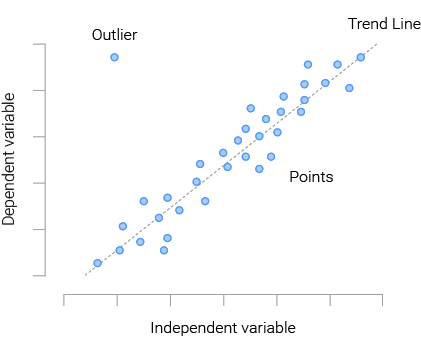
Scatterplots: A scatter plot uses dots to represent values for two different numeric variables. The position of each dot on the horizontal and vertical axis indicates values for an individual data point. Scatter plots are used to observe relationships between variables. In the graph above, we can see the outlier in a different spot from the other observations, Scatter Plots helps us to identify outliers when working with a large dataset.
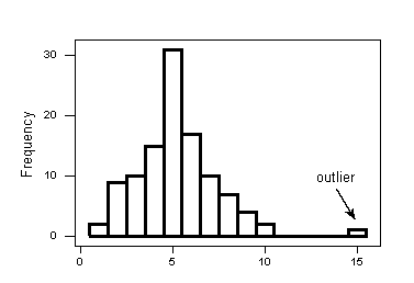
Histogram: A histogram is a plot that lets us discover the underlying frequency distribution (shape) of a set of continuous data. This allows the inspection of the data for its underlying distribution (e.g., normal distribution), outliers and skewness. A histogram is used to summarize discrete or continuous data. In other words, it provides a visual interpretation of numerical data by showing the number of data points that fall within a specified range of values (called “bins”).
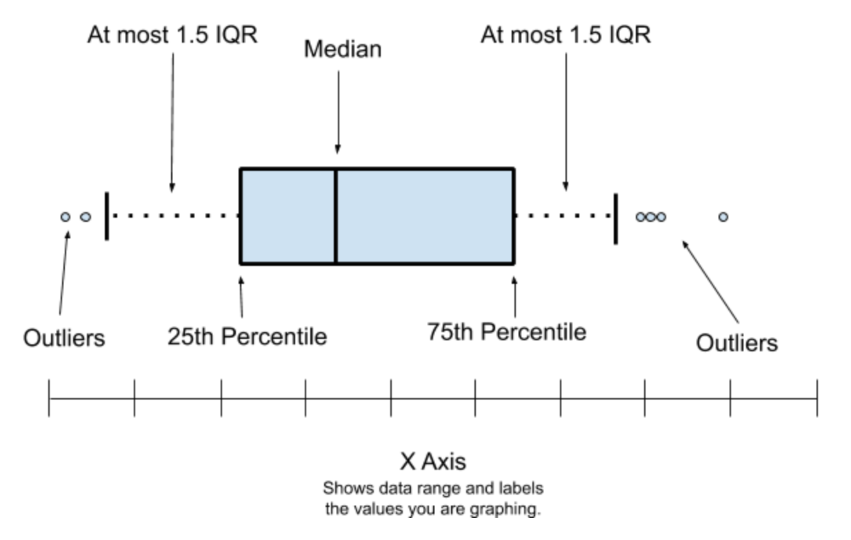
Box Plots: A box plot (also known as box and whisker plot) is a type of chart used to visually show the distribution of numerical data and skewness through displaying the data quartiles (or percentiles) and averages. Box plots show the five-number summary of a set of data: including the minimum score, first (lower) quartile, median, third (upper) quartile, and maximum score.