Nigeria is considered a third world country but do you know that according to Statista there is 57% internet usage penetration? Do you know that 2.5 quintillion bytes of data are generated every day? Hidden in this plethora of structured and unstructured data is valuable information that will give any forward-thinking business insight.
Dashboarding and Business intelligence are very important tools to give top managers a holistic overview of where the business is and where it is headed but have you ever wondered about the magic that puts raw numbers into better context by representing them in beautiful, colour-coded charts and graphs? you guessed very right! DATA VISUALIZATION.
Humans are wired to better understand a story and raw data gives off the opposite vibe. With raw data, patterns can not easily be spotted and things are all over the place. This situation easily brings confusion to the mind hence the importance of DATA VISUALIZATION.
Even if you’re not a data analyst, you can build data visualizations with lightweight Business Intelligence tools like PowerMetrics. You will witness your data evolve after connecting it to a pre-built or custom connection. All you have to do now is choose the sort of visualization that best expresses the story or message you want to tell with your data.
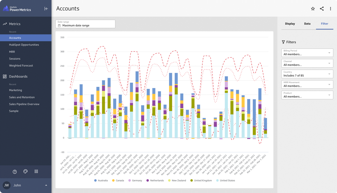
PowerMetrics User Interface
Img src: GetApp
My aim is that, with the help of this article and the other beginner guides described in later topics, you will have all of the tools you need to tell—and understand—your data story a lot better.
Here’s what I’ll be talking about in this article:
-What is the definition of data visualization?
-What is the purpose of data visualization?
-What characteristics distinguish an excellent data visualization?
-What factors should I consider when selecting a visualization for my dashboard?
-12 different types of data visualizations that are regularly utilized.
-How to improve the quality of your data visualizations
Let’s get started!
DEFINITION OF DATA VISUALIZATION
A data visualization is a graphical depiction of data or information, such as converting raw data from a spreadsheet into a bar or line chart. You can readily comprehend and analyze trends and outcomes in your data by using data visualizations.
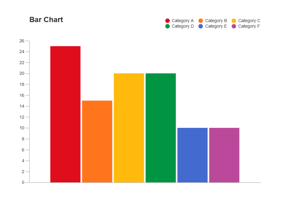
Bar chart data visualization sample
Img src: SmartDraw
The best graphical representation to use is determined by the story you’re trying to tell. You can pick any visualization and expect it to work, but it’s worth the time and effort to pick and personalize the perfect one for long-term impact.
What is the best place to post data visualizations? On the nightly news, in tweets, and on the front page of the newspaper, data visualizations can be found. In a business setting, data visualizations are frequently found in reports, presentations, or on business dashboards.
Data visualizations are displayed on business dashboards to assist you in:
-Keep an eye on critical metrics connected to your company’s growth.
-Bring all of your data sets and sources together in one place.
-Provide key decision-makers with an overview of business performance.
-Get your team on the same page when it comes to performance and results.
-Interpret data intuitively and logically
WHAT IS THE PURPOSE OF DATA VISUALIZATION
Data visualizations assist us in telling stories. Humans are visual creatures by nature, drawn to colours, forms, and patterns. So knowing how to use those basic human factors to turn statistics into images is an awesome talent to have.
The maxim “a picture is worth a thousand words” is probably familiar to you. I’d want to make a minor change: data visualization is worth a thousand words.
A data visualization, when done correctly, will explain the story that is hidden behind the statistics in your spreadsheet without using words. Your line chart will slowly ascend to the upper right if you’ve had a good quarter and your revenue is increased. It’s a lot easier to tell that story than it is to sort through the rows.
WHAT CHARACTERISTICS DISTINGUISH AN EXCELLENT DATA VISUALIZATION
Data visualization is an art form, and the efficacy of visualization is determined by how well it is executed. It’s only effective if done correctly. Have you ever opened a spreadsheet or a presentation deck only to discover out-of-context data and thought to yourself, “This can not be right” Data visualization facilitates data analysis. Everyone can comprehend difficult facts, and as a result, everyone is confident in their decision-making and adds value to key discussions.
We consider effective data visualizations to be graphical representations that accomplish their goals. If a user can interpret your visualization by asking questions about the data displayed rather than how or what is displayed, you’ve succeeded.
“How can I choose the proper visualization to ensure it fulfils its intended purpose?” you might be wondering.
Let’s have a look at it in more detail.
WHAT FACTORS SHOULD I CONSIDER WHEN SELECTING A DATA VISUALIZATION FOR MY DASHBOARD
It’s not as simple as picking any data visualization to convey your facts and data. It’s critical to match your data with the appropriate visualization so that you and your users can get the most out of it. If you’re not sure where to begin, consider the following five questions.
-What is the relationship between the data sets that you are trying to figure out?
-Do I want to learn about data distribution and find outliers?
-Is it more important for me to compare many values or to examine a single value over time?
-Do I want to look at the patterns in my data?
-Is this data visualization a critical component of my overall data story?
These five questions will help you narrow down which category you should concentrate on, and then drill down on it.
12 DIFFERENT TYPES OF DATA VISUALIZATION ARE FREQUENTLY USED.
While there are many different forms of data visualizations, you should select the one that is most appropriate for your audience. In a business setting, selecting the visualization that will help you extract the most value from your dashboard data is critical. It might be difficult to determine which visualization is ideal for your data collection, dashboard, and users, but I hope that this article will assist you in doing so.
Once you’ve decided on A data visualization, think about how it will fit into your overall dashboard design. In our dashboard design guide, we have all the ideas and tricks you’ll need to create an amazing dashboard.
In a lightweight modern BI tool like PowerMetrics, there are a number of data visualizations to choose from, including:
-Bar or column chart
-Line or area chart
-Pie or donut chart
-Treemap
-Radar chart
-Waterfall chart
-Heat map
-Summary chart
-Table
-Scatter chart
-Bubble chart-Combination chart
TO IMPROVE THE QUALITY OF YOUR DATA VISUALIZATION
When designing a dashboard or data visualization, get feedback from the individuals who will be using it. Iteratively develop. And keep in mind that you’re unlikely to get it right the first time. Make sure you take the time to solicit feedback and determine what is working and what needs to be improved. Data visualization is a skill that must be honed, just like any other.
What is the most useful piece of advice I can offer? Make your data visualizations as enjoyable as possible. Create a data visualization for your fantasy hockey or football league, the financial market, or even your favourite film genre if you’re trying to improve your talents outside of the business world.
Hope you learned something today? Subscribe to our newsletters to get these informative articles delivered straight into your mailbox.